The Challenge & Goals
We’ve worked with Iron to Iron on our brands Pinhole Press and Pinhole Pro. They never fail to deliver innovative solutions that take our product to the next level.
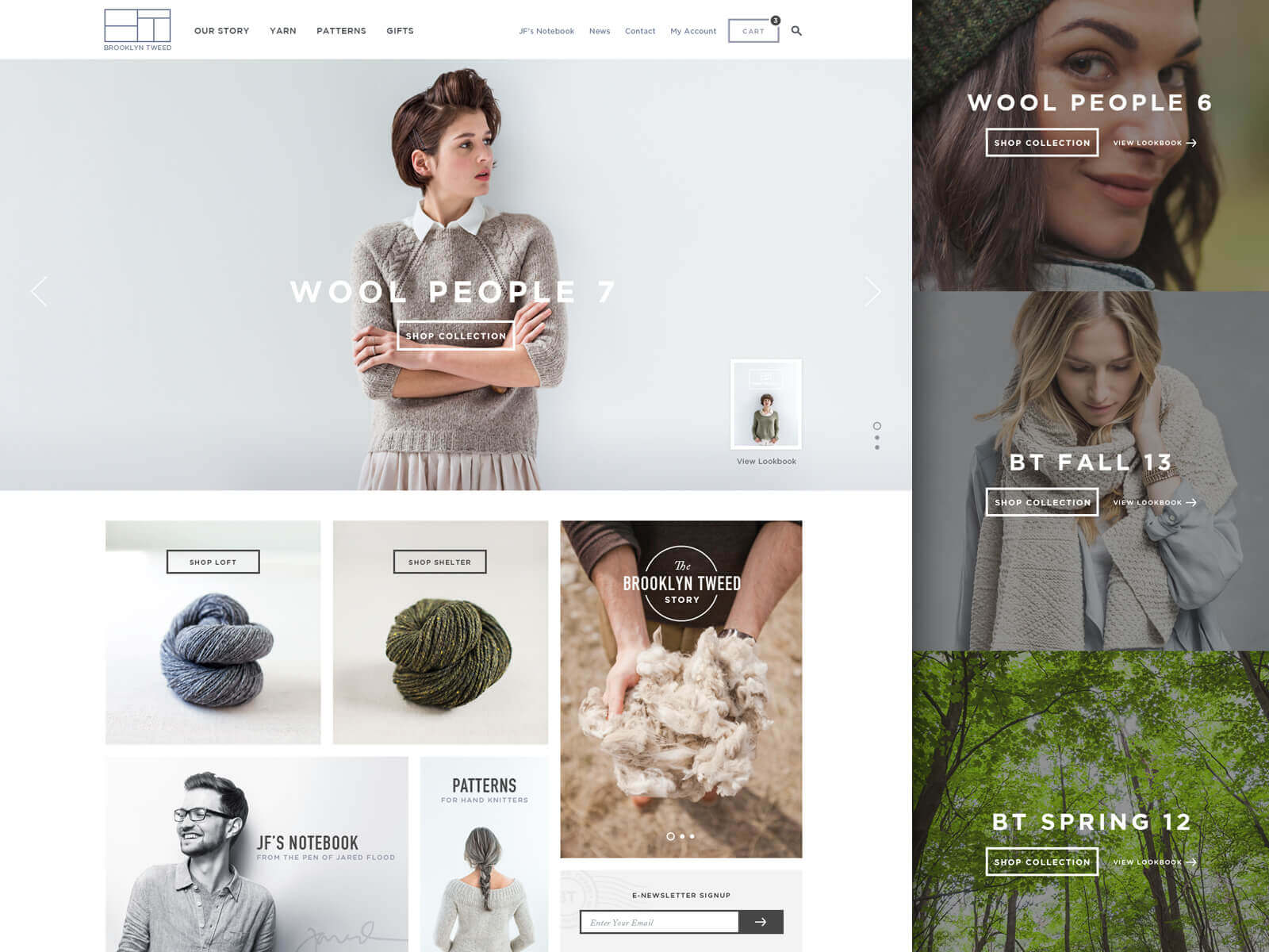
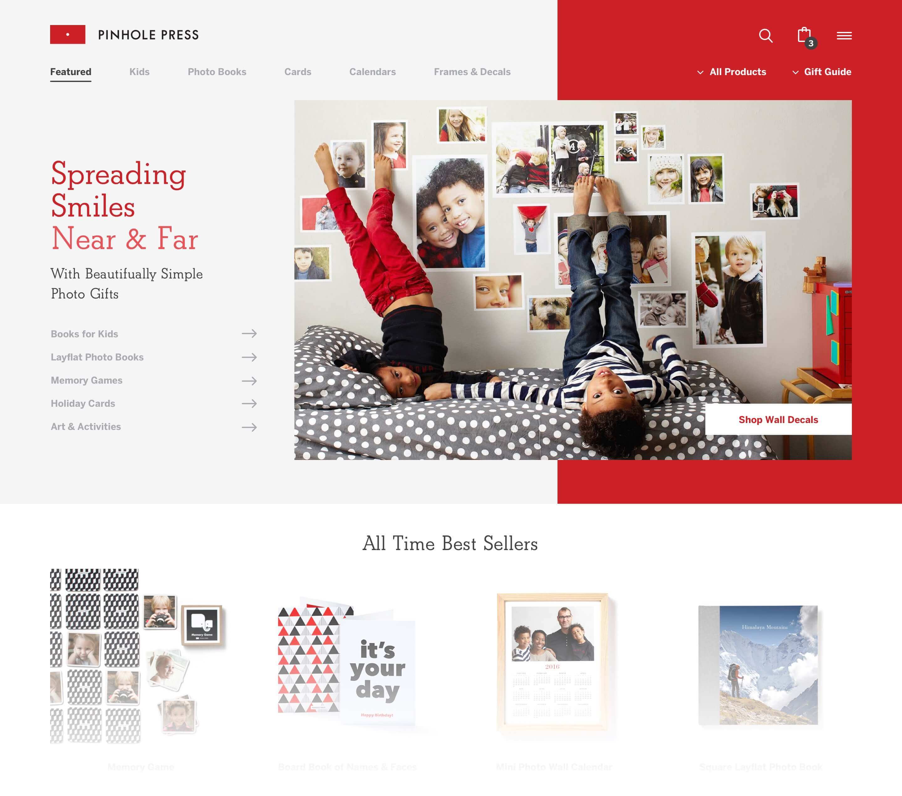
Pinhole Press is a brand known for its minimally beautiful, customizable photo gifts (cards, calendars, books, etc). Their library of marketing photography is pretty spectacular too. Their website didn't quite measure up to the same caliber; neither visually nor functionally. Browsing products felt both cumbersome and uninspired. We knew right from the start that Pinhole Press had the potential to have an outstanding site and we were thrilled to have the opportunity to partner with them and make that happen.
The large variety of standard products combined with their collections of seasonally specific products created quite the unique challenge. It was important to feature specific products that were relevant to the season, while also showcasing other top sellers that users may be interested in. The solution was not only found in the design structure, but mainly within the organization of the navigation and sitemap.
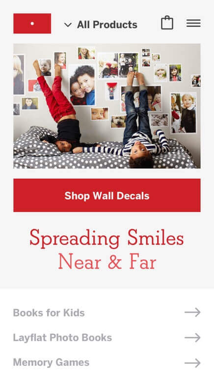
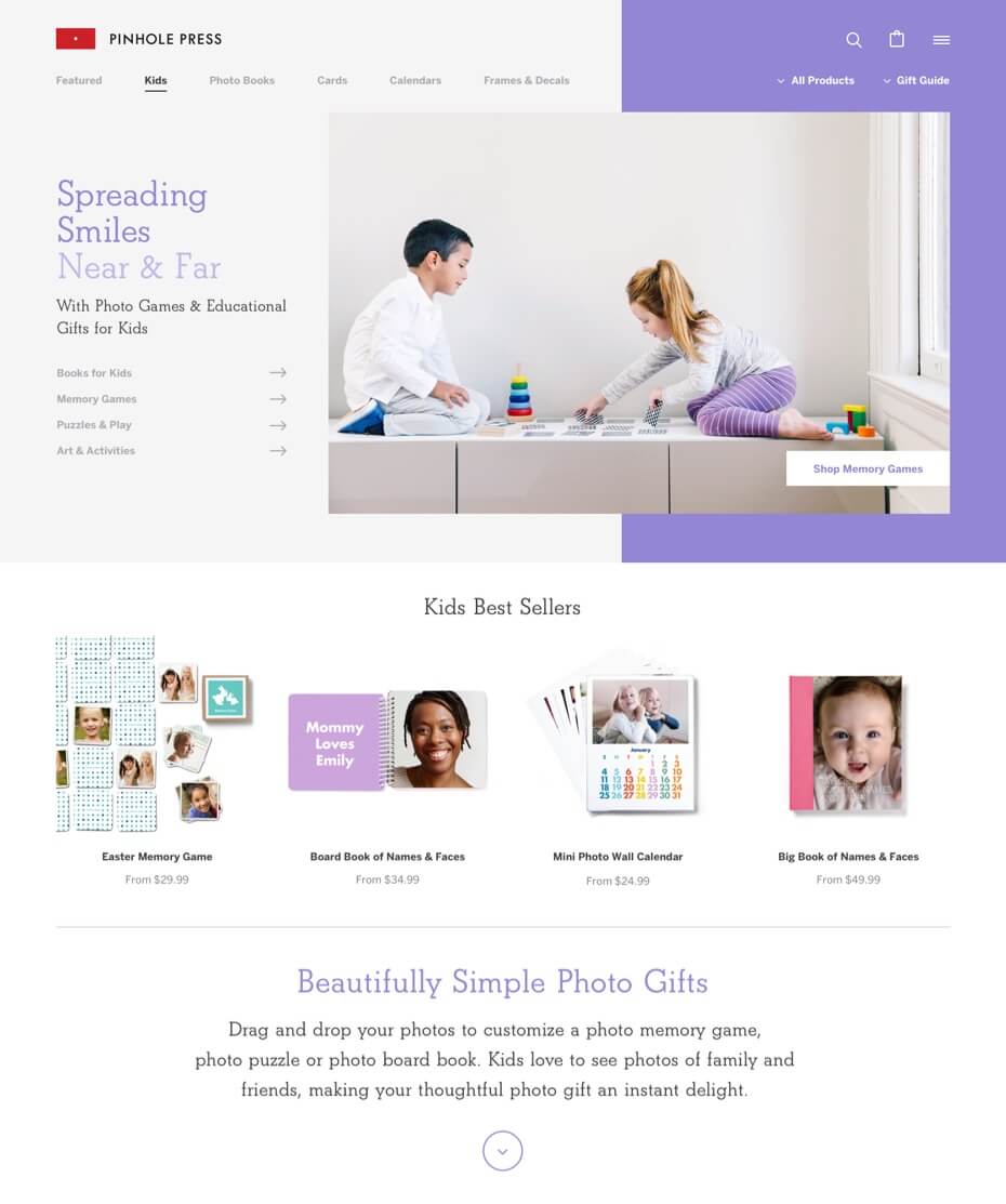
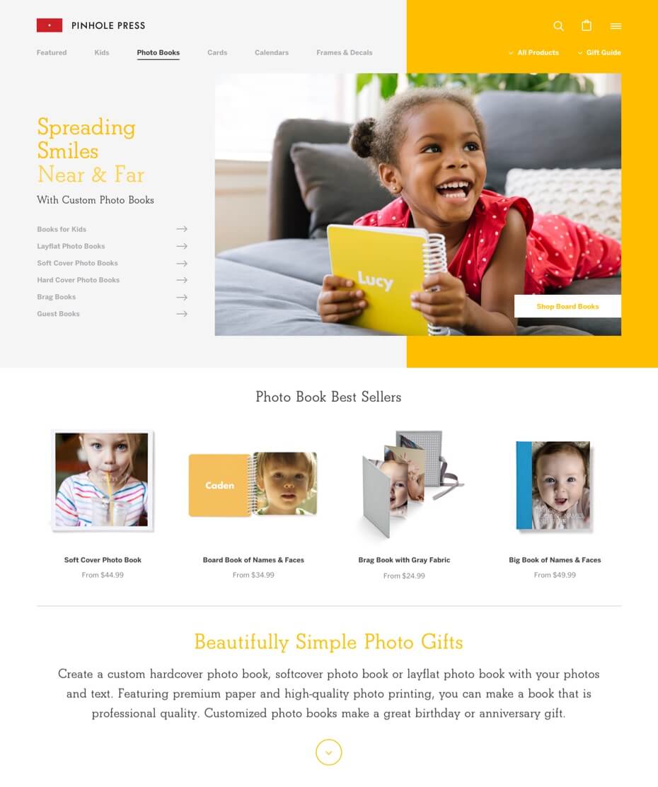
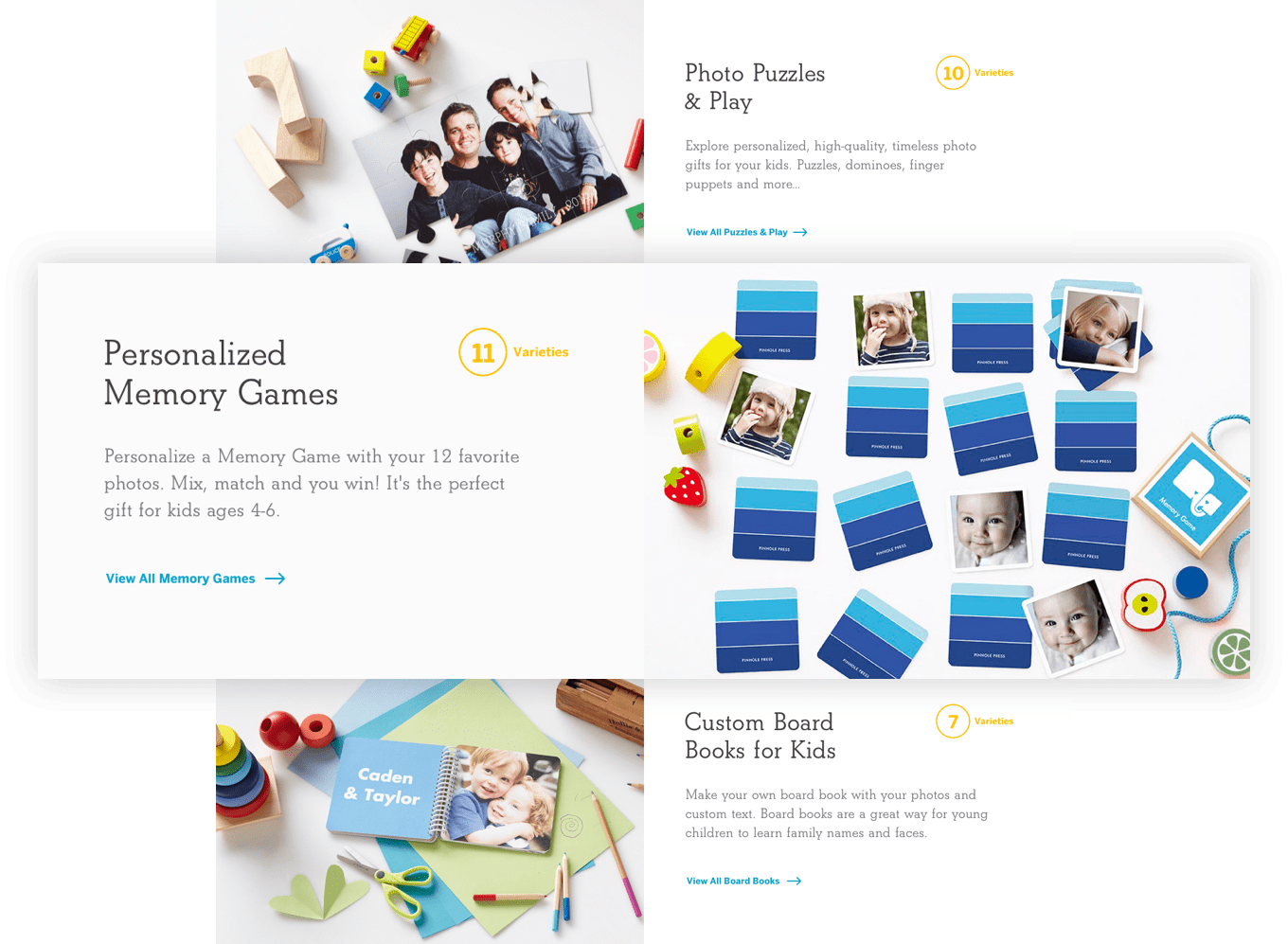
Our concept was to create not just one, but many homepages that were separated by tabs. Each tab would feature a variety of products found within a particular category; one of which would always be the most upcoming holiday/season while the rest were geared more towards top sellers. Beyond this we also created a catch all, stand alone menu which contained the entire catalog of products. This way no matter what your browsing preference was you would be sure to find what you were looking for.
While the structure of each tab/homepage was mostly the same, each had their own unique look that was defined by color and supportive photography. This helped keep users engaged when browsing. Each tab felt like a new and exciting experience that was full of new products and possibilities.
The same fun, inviting and playful feel that we created for the homepage(s) was carried through the rest of the site as well. The full product index as well as each products specific detail page were crafted with the intention of optimization and ease-of-use.
Simply put: we love how this site came out. It’s fun to use and interact with. It also makes it easy to find what you’re looking for. Most importantly it brings the overall brand of Pinhole Press to a level of excellence across every platform.
Web
- Sitemap Creation
- Content Strategy
- Information Architecture / Wireframing
- Website Design
- Front End Development
- WordPress Development
- Responsive Development
- eCommerce Development
- Content Migration
Branding
- Visual Web Strategy
- Icon Design
- Print Design
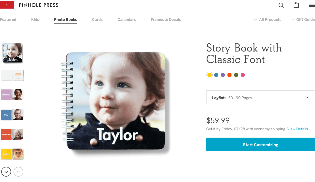
Let the Products do the Talking
Pinhole Press products speak for themselves. So putting them in the spot light and keeping the supportive content to a minimum is a pretty safe bet. When it’s so easy to imagine how good these products would look with your own personal photos, all you really need is a simple encouragement to "Start Customizing".
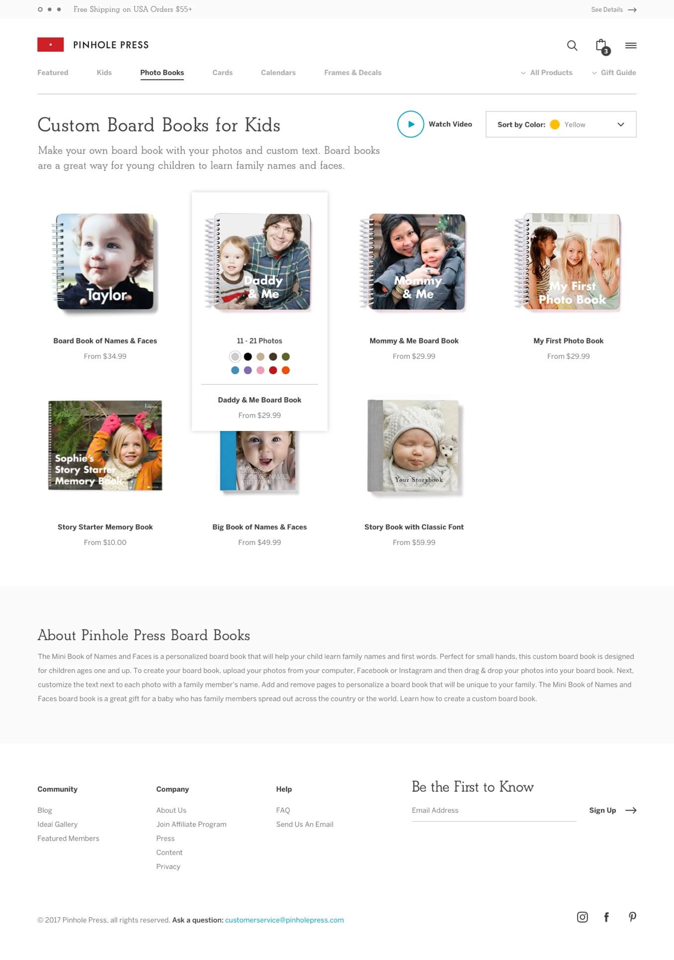
Optimized Browsing
The product waterfall/index page is a staple amongst companies who offer a wide variety of products online. Knowing which details to show and hide is they key to making this page successful. In this case the primary detail we wanted to highlight was the product itself along with its respective price. Details concerning each product were only a hover away. This allowed us to show more products at a greater size which created an optimized browsing experience.
Imagery, Colors, & Typography
It’s hard not to smile when you’re looking at fun images, bright colors, and playful typography. That’s why we created an environment that reflects the very products that we’re trying to sell.
We’ve worked with Iron to Iron on our brands Pinhole Press and Pinhole Pro. They never fail to deliver innovative solutions that take our product to the next level.